1. Acquisition > Use Breadcrumbs For Orientation
Use breadcrumbs for orientation to reduce SaaS churn
Breadcrumbs are an exceptional way to increase user experience and reduce churn. Using breadcrumbs let visitors know where they're on your website and how to switch between pages easily.
●● INTUITIVENESS
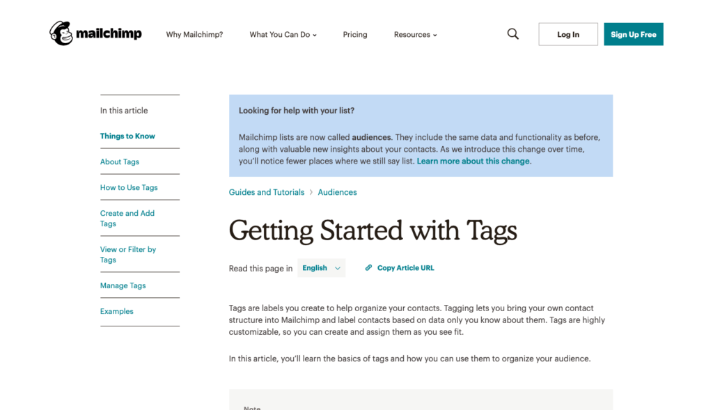
MailChimp uses breadcrumbs on its help section clearly guiding visitors where they're now and how they got here.
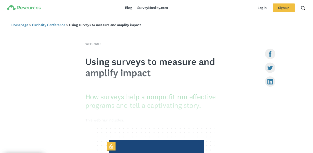
SurveyMonkey smartly uses breadcrumbs right at the top of the page under primary navigation to boost user experience.
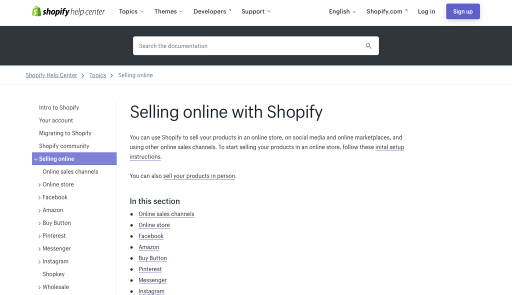
Shopify uses navigation breadcrumbs creatively with a sidebar to make it easy for readers to jump from one page to another with just one click.
How to use the technique
- Use breadcrumbs to display current location. The location should be relevant to the website’s structure or it should be attribute-based. Conduct research to figure out which type will work for your website. Read our churn optimization framework on how to do research like a pro.
- Start breadcrumb trail with a link to the homepage and the last trail should be the current page and it shouldn’t have a hyperlink.
- Reduce breadcrumb for mobile. Use trail for the previous level instead of showing complete trail (which looks messy).
- Use a recognizable symbol for separators. The greater than sign (>) is the best and universally acceptable symbol. Any symbol that users cannot understand will make them churn.
- Test breadcrumb styles and designs. Yes, you should test different variations for conversion optimization. Breadcrumbs can have a significant impact on user engagement, churn, and user experience. Our churn optimization framework is your best resource for this.
Mistakes to avoid
- Using breadcrumbs as a replacement of primary navigation. Don’t use these two interchangeably. Primary navigation is a must and should never be replaced.
- Always using breadcrumbs. There are certain website designs (like flat design) and certain pages (like landing pages) where using breadcrumbs do more harm than good.
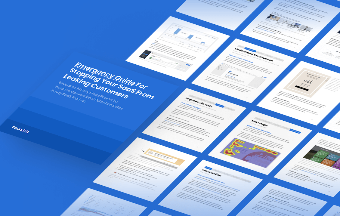
FREE OPTIMIZATION GUIDE
Stop Your SaaS From Leaking Customers With Our Proven Optimization Process
We will reveal an EXACT framework we use to improve conversion & retention rates of our SaaS clients by at least 30%.
DOWNLOAD FREE PDFResearch evidence
Nielsen Norman Group research revealed that there are multiple benefits of using breadcrumbs while there are no drawbacks. Using breadcrumbs on a website improves navigation, makes it user-friendly, and improves the user experience.
>>>
Integrate breadcrumbs without thinking. When implementing correctly, there are absolutely no major drawbacks.
Related techniques SEE ALL THE TECHNIQUES >
LOOKING FOR THE WAY TO STOP YOUR SAAS FROM LEAKING MONEY?
Download our FREE guide with the battle-tested process for SaaS conversion & retention optimization
Get a PDF with an exact step-by-step framework we use with our SaaS clients to research why their SaaS is leaking money, define optimization opportunities and run data-driven experiments that bring tangible ROI.