1. Acquisition > Optimize Your Typography
Optimize your typography to reduce SaaS churn
It's essential to ensure your typography follows best-practices for readability to make it easy to perceive. Right font style and size will improve overall user experience and reduce churn in the long run.
●● INTUITIVENESS
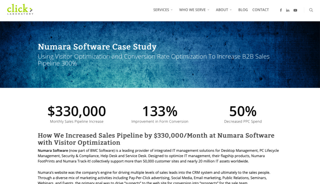
Numara Software changed its font size and increased line spacing. This reduced bounce rate by 10%, exit rate by 19%, increased page per visit by 24%, and the conversion rate was increased up to 133%.
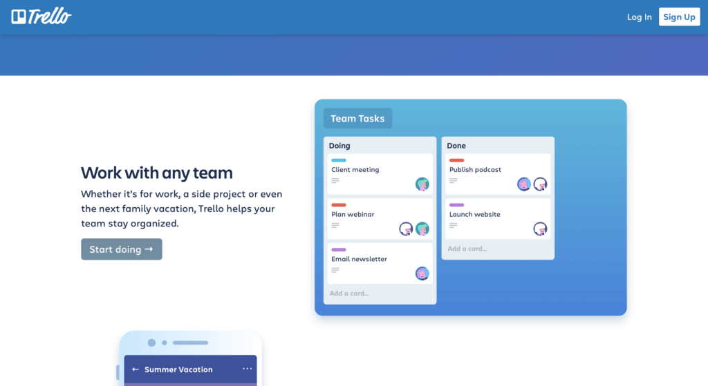
Trello has perfect typography that is easy-to-read and is consistent with their brand and logo.
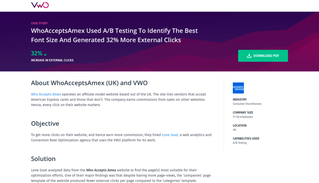
WhoAcceptsAmex increased its external clicks (32%) by identifying the most suitable font size.
How to use the technique
- Decide with the typography of your website based on buyer personas. Conduct research. Ask your ideal customers what font they prefer. Our churn optimization framework has step-by-step instructions on how to conduct research.
- Choose a typeface consistent with your brand. Use one or maybe two typefaces throughout your website. You don’t want to confuse visitors when they visit your website next time with a different typeface.
- Use standard fonts. Your best bet is to use Google Web Fonts. Standard fonts are familiar which makes reading easier.
- Font size and line height are the two vertical dimensions of typography that should be taken care of and should be consistent throughout the landing page. Recommended font size is 16 pixels and line height should be 1.5.
- Line width is the horizontal dimension that needs your attention. Keep the line width suitable enough to improve readership and comprehension. Readers prefer short line width 8 to 10 words or 40 to 60 characters long.
- Test different variations. Optimizing typography is only possible with A/B testing. Run tests and see how typography impacts churn, conversion rate, readership, and interest. This guide will help you perform split tests with ease.
Mistakes to avoid
- Not taking typography seriously. This is a lethal mistake. A small typographical change can have a notable impact on conversions. Don’t ignore its importance.
- Relying on best practices. While it’s good to follow best practices, don’t rely solely on other people’s experiences. Figure out what works for your target audience with continous testing and move from there.
FREE OPTIMIZATION GUIDE
Stop Your SaaS From Leaking Customers With Our Proven Optimization Process
We will reveal an EXACT framework we use to improve conversion & retention rates of our SaaS clients by at least 30%.
DOWNLOAD FREE PDFResearch evidence
Errol Morris conducted an experiment to measure if a typeface has any impact on the credibility of the written text. The results revealed that people respond to typefaces differently. Some fonts had a high degree of acceptance while others had a high degree of disagreement.
!?!
According to the research, some fonts are responsible for the high degree of acceptance while others cause disagreement
Related techniques SEE ALL THE TECHNIQUES >

LOOKING FOR THE WAY TO STOP YOUR SAAS FROM LEAKING MONEY?
Download our FREE guide with the battle-tested process for SaaS conversion & retention optimization
Get a PDF with an exact step-by-step framework we use with our SaaS clients to research why their SaaS is leaking money, define optimization opportunities and run data-driven experiments that bring tangible ROI.