May 7, 2019

Use Contrast For Your CTA

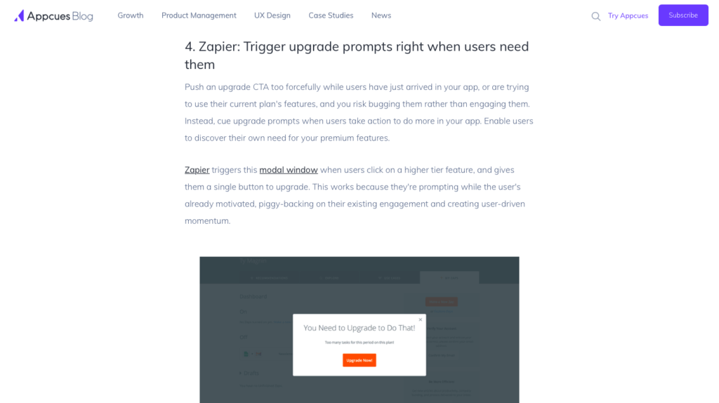
1. Acquisition  >  Use Contrast For Your CTA

Use contrast for your CTA to reduce SaaS churn

Use of contrasting CTA buttons and text have a drastic impact on conversions, churn, and retention. Right color at the right location is all your SaaS needs on its landing page.

●● INTUITIVENESS

Friendbuy

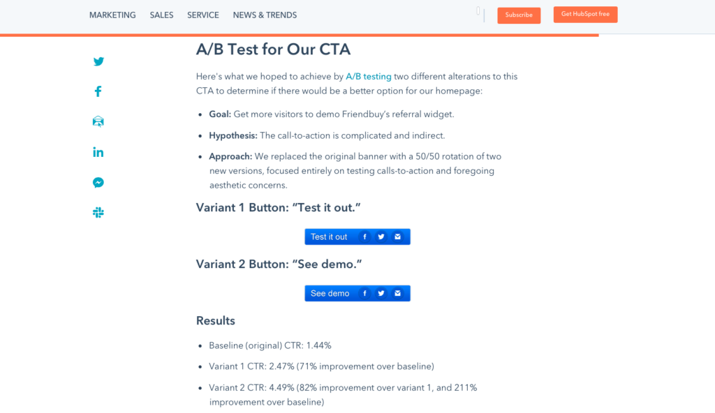
Friendbuy improved its CTR by 211% by changing its CTA button.

37Signal

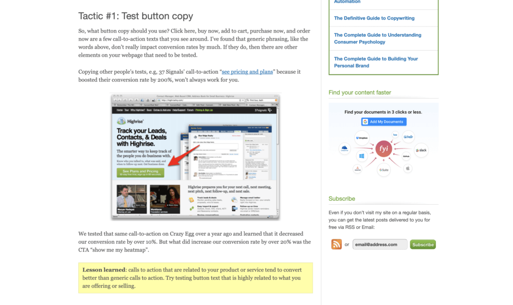
37Signal, now Basecamp, increased its signups by 200% when they tweaked their CTA button and text.

ArtsyEditor

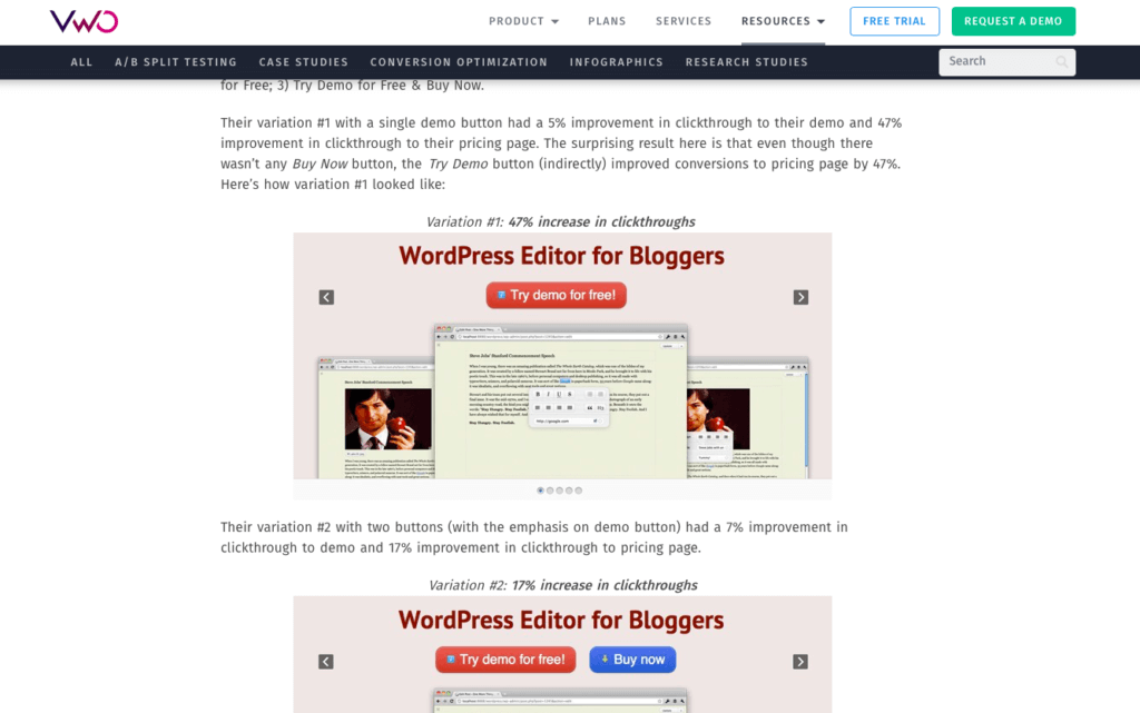
ArtsyEditor successfully increased CTR by 47% after tweaking the text of the CTA button.

How to use the technique

  • Identify a landing page and tweak its CTA to begin with. Start with one CTA at a time, measure the impact of the change, take necessary action, and repeat. Read this detailed churn optimization framework
  • Make CTA prominent. The purpose of CTA is to get the attention of the visitors. This is why you should use contrasting colors to make it stand out from the rest of the content and all other elements on the page.
  • Link CTA color to a buyer persona. Men and women like different colors. Using appropriate colors for CTAs based on audience demographics, culture, and personal likes will significantly boost conversions and churn.
  • Use dark CTA colors on white background. If your landing page has a lot of white space and its background is white, use red, blue, black, and other dark colors for CTAs.
  • Change the CTA text including text font, color, and CTA. It isn’t always the color of the button that matters. Test all CTA conversion optimization options.
  • Place CTAs strategically. Don’t just change the color but change CTAs location for conversion optimization and churn reduction. Place CTA close to its origin. We have this actionable guide to help you with conversion optimization for all the aspects of a landing page.

Mistakes to avoid

  • There is no single best CTA color that will create a true contrasting effect. Keep testing different colors. Don’t stop. There is always room for improvement.
  • Contrasting CTA button should always be RED. What color you choose for CTA depends on the surrounding elements and the overall theme of the landing page. Red isn’t always contrasting.
  • Ignoring your brand. CTA color isn’t more important than your brand. Any color that violates your brand’s image or your brand’s color theme should be used with caution.

FREE OPTIMIZATION GUIDE

Stop Your SaaS From Leaking Customers With Our Proven Optimization Process

We will reveal an EXACT framework we use to improve conversion & retention rates of our SaaS clients by at least 30%.

DOWNLOAD FREE PDF


Research evidence

According to a HubSpot study, red CTA button outperformed the green CTA button by a whopping 21%. This was primarily due to the fact that red button created contrast and was prominent on the page.

21%

This is how contrasting red CTA button outperformed the green CTA button


Related techniques SEE ALL THE TECHNIQUES >

LOOKING FOR THE WAY TO STOP YOUR SAAS FROM LEAKING MONEY?

Download our FREE guide with the battle-tested process for SaaS conversion & retention optimization

Get a PDF with an exact step-by-step framework we use with our SaaS clients to research why their SaaS is leaking money, define optimization opportunities and run data-driven experiments that bring tangible ROI.

May 7, 2019

Less Than 2-Steps Forms

4. Revenue  >  Less Than 2-Steps Forms

Include less than 2-steps forms to reduce SaaS churn

Make it simple and easier for users to upgrade to a paid plan. Let them upgrade plan in two steps and remove all barriers that cause friction. A major reason for high churn is friction in the upgrading process.

●● INTUITIVENESS

Insound

Insound increased its checkout conversions by 54% with a minor tweak.

Intuit

Intuit added a live chat option on its checkout page which increased conversions by 20%.

Starngeloopnetworks

Starngeloopnetworks increased conversions by 66% after removing extra pages from its checkout process.

How to use the technique

  • Use existing data to simplify the process. You have personas, you have their usage statistics, you have enough personal details, and behavioral data. Use it to make the entire process simple and effective. If you don’t know how to do it, grab our free churn optimization framework
  • Reduce the number of steps. The steps a user has to take to convert from free to a paid customer should be minimized. If you have payment details, it should be a one-step process. If you don’t have payment details, it shouldn’t have more than two steps. You can minimize churn with this simple technique.
  • Reduce form fields. Form fields add friction. Keep the form short. Remove unnecessary fields. You'll get all the time to get more details after they will convert.
  • Add progress notification. Let users know how many steps are left. It will reduce churn and they will be more likely to complete the transaction.
  • Continuous improvement is the key to success. Keep removing barriers as long as it improves conversions. Read this free guide to get more details on how to do it practically.

Mistakes to avoid

  • Adding distractions. A big mistake is related to adding distractions that make users churn. Remove everything that’s not needed from the process.
  • Asking for irrelevant information will increase the churn rate because it irritates users. And while they're busy adding information, they might lose attention and might leave in the middle.

FREE OPTIMIZATION GUIDE

Stop Your SaaS From Leaking Customers With Our Proven Optimization Process

We will reveal an EXACT framework we use to improve conversion & retention rates of our SaaS clients by at least 30%.

DOWNLOAD FREE PDF


Research evidence

Baymard conducted a survey to understand why consumers leave cart without paying. Over 26% of consumers reported that they will leave a website if the checkout process is long or complicated. Removing friction and making the checkout process convenient is a sure way to improve conversions and reduce churn.

26%

According to Baymard, this is exactly how many people get so tired with your long and lousy checkout flow that they leave and never get back.


Related techniques SEE ALL THE TECHNIQUES >

LOOKING FOR THE WAY TO STOP YOUR SAAS FROM LEAKING MONEY?

Download our FREE guide with the battle-tested process for SaaS conversion & retention optimization

Get a PDF with an exact step-by-step framework we use with our SaaS clients to research why their SaaS is leaking money, define optimization opportunities and run data-driven experiments that bring tangible ROI.

May 7, 2019

Include Clear “Upgrade” CTA

4. Revenue  >  Include Clear “Upgrade” CTA

Include clear “Upgrade” CTA to reduce SaaS churn

A call to action lets users know what they should do to upgrade their plan. It tells users they can upgrade anytime without any hurdle. A clearly visible, prominent, and descriptive CTA reduces churn.

●● INTUITIVENESS

Branch

Branch uses descriptive CTAs within its app to let users know how they can access a premium feature.

Buffer

Buffer has a permanent above the fold CTA with a strong copy to persuade users to upgrade whenever they're ready.

Zapier

Zapier shows users simple but descriptive CTAs when they access a feature not available with their plan.

How to use the technique

  • Personalize CTA. Use behavior data to make CTA relevant. For example, share usage details or mention a recent action in the CTA copy. Link CTA to buyer personas for better customization. Use our free churn optimization framework to get better at personalization and research. 
  • Add CTA in the app. Make it visible all the time. Keep it above the fold. This will constantly remind users of what they're missing and how to upgrade. It will reduce churn significantly.
  • Make CTA descriptive. Describe benefits in the CTA copy. Add details as to what will happen after the click. Use power words.
  • Use contrasting colors. The CTA has to be prominent and fairly visible. It should grab attention instantly. Use contrasting colors and white space for prominence.
  • Add CTA in all the emails you send to users after sign up. Adding a CTA in email sequence will increase trial to paid conversions.
  • Test different variations. Create multiple CTA buttons, place them at different locations, and test them all for conversion optimization. This free guide will show you how to do it.

Mistakes to avoid

  • Using generic CTAs. Don’t do it. CTAs like ‘click here’ and ‘more info’ won’t work. Spend time to create better CTAs.
  • Not making UVP clear. Text around the CTA should be relevant and it needs to focus on the UVP and benefits that users will get after the upgrade. CTAs don’t survive all alone without any context.

FREE OPTIMIZATION GUIDE

Stop Your SaaS From Leaking Customers With Our Proven Optimization Process

We will reveal an EXACT framework we use to improve conversion & retention rates of our SaaS clients by at least 30%.

DOWNLOAD FREE PDF


Research evidence

Jeffrey Vocell analyzed 330K CTAs over a time period of 6 months. He found that personalized CTAs convert 202% better than other types of CTAs. He calls them smart CTAs that are relevant to the user’s interest. This makes CTAs appealing and users are more likely to click and convert.

202%

This is how much better personalized CTAs convert in comparison with other types of Call To Action buttons. The lesson? Relevant = Good.


Related techniques SEE ALL THE TECHNIQUES >

LOOKING FOR THE WAY TO STOP YOUR SAAS FROM LEAKING MONEY?

Download our FREE guide with the battle-tested process for SaaS conversion & retention optimization

Get a PDF with an exact step-by-step framework we use with our SaaS clients to research why their SaaS is leaking money, define optimization opportunities and run data-driven experiments that bring tangible ROI.

May 6, 2019

Send Lifecycle Emails

2. Activation  >  Send Lifecycle Emails

Send lifecycle emails to reduce SaaS churn

Sending regular timely emails is a great way to engage users, increase the activation rate, and reduce churn. Personalized emails sent during critical lifecycle stages to address issues will make the user’s life easier and more fun.

●●● INTUITIVENESS

Kingspoint

Kingspoint has a crash course on conversion optimization. It ends 8 emails in 14 days with a goal to boost conversions. These emails have a 65% open rate and CTR of 31%.

Moz

Moz sends an effective activation email with one clear goal and a prominent CTA.

Zapier

Zapier sends out a personalized email to users who haven’t used their app after sign up.

How to use the technique

  • Segment users based on their stage. This is the only way to send lifecycle emails that are personalized. This can be achieved by using customer flow maps. You can find more information in our churn optimization framework.
  • Send a welcome email instantly. The first email users receive after sign up should reach their inbox in under 90 minutes, else they will churn.
  • Personalize emails. Link email software with customer flow map. Track progress with tracking tool. Skips emails for tasks that a customer has already completed. Send emails for the next most critical task in the flow and remind them of what they're missing (or where they left).
  • Have a single goal per email. Don’t try to tell new users everything in a single email. Each email you send should have a single goal with a clear action plan and a powerful CTA.
  • Treat engaged and inactive users differently. Send them different emails. However, your focus should be on engaged users who are moving ahead in the lifecycle. Keep them engaged. Don’t let them churn.
  • Send actionable emails with clear instructions. Copy matters. It should be persuasive, short, and actionable.
  • Measure performance of lifecycle emails. Identify loopholes. Tweak underperforming emails. Identify common user issues. Data analysis is the crux here. Don’t know how to do it? Check out this free guide.

Mistakes to avoid

  • Not offering help. Emails cannot provide answers to all the problems. Invite them to send you an email or contact live chat if they have any unaddressed issues.
  • Poor copy. Sending an email for the sake of an email doesn’t work. It’s what you write in the email that matters. Avoid copy-related mistakes as it will negatively impact your brand as a whole.
  • Not asking for feedback. It is a big mistake that you should never make. Get feedback from inactive users and ask them why they stopped using your app. Their feedback will help you improve things that users have problems with.

Research evidence

The eDigital survey found that live chat has the highest customer satisfaction (73%). Customers love live chat because they can get answers to their queries almost instantly. Customers expect to receive an answer to their queries in as low as 1 minute and that’s why they prefer live chat.

1m

Average expectation of a reply time in live chat is only 1 minute. It's difficult to keep up with, but in case of success 73% of your customers will be satisfied. 


Related techniques SEE ALL THE TECHNIQUES >

LOOKING FOR THE WAY TO STOP YOUR SAAS FROM LEAKING MONEY?

Download our FREE guide with the battle-tested process for SaaS conversion & retention optimization

Get a PDF with an exact step-by-step framework we use with our SaaS clients to research why their SaaS is leaking money, define optimization opportunities and run data-driven experiments that bring tangible ROI.

May 6, 2019

One Offer Per Page

1. Acquisition  >  One Offer Per Page

Have one offer per page to reduce SaaS churn

Multiple offers on a single page won’t help you sell more. It backfires. Have one offer per landing page to boost conversions and to lower churn rate for repeat customers.

●● INTUITIVENESS

Sims

Sims increased game registrations by 128% simply tweaking their landing page. They tested multiple offers to finally find the one that worked.

Wedbuddy

Wedbuddy increased signups for the free trial by 73% by focusing only on the free trial on its landing page.

ServerDensity

Server Density increased its revenue by a whopping 114% after tweaking its pricing plan on the landing page.

How to use the technique

  • Set a clear goal for each landing page you create. What do you want to sell? Which buyer persona you'll target? Read more about setting clear goals in our free guide.
  • Have one offer per landing page. The offer should be consistent with the landing page’s goal. This is essential to keep visitors hooked and to lower churn.
  • The offer should stand out and must be clear on the landing page. The headline, copy, CTAs, white space, images, videos, and all other elements should be consistent with the offer and your goal.
  • Keep CTAs consistent with the offer. You can have multiple CTAs but these should link to one and only one offer.
  • Test and tweak each landing page and its offer. Monitor conversions, churn rate, user experience, etc. to see what combination works best. Find more actionable testing techniques in our free guide.

Mistakes to avoid

  • Using one offer per landing page for the entire audience. Create highly customized landing pages with the most appropriate product for each buyer persona. One size doesn’t fit all.
  • Considering multiple pricing plans as one offer. As a SaaS company, you have one product so it doesn’t mean you have to use one landing page only. Use different landing pages for different pricing offers.

FREE OPTIMIZATION GUIDE

Stop Your SaaS From Leaking Customers With Our Proven Optimization Process

We will reveal an EXACT framework we use to improve conversion & retention rates of our SaaS clients by at least 30%.

DOWNLOAD FREE PDF


Research evidence

A study published in APA found that when buyers have fewer options to choose from (limited choices), they're more likely to purchase (30%) as compared to if they're presented with multiple varieties (3%).

30%

Of buyers are more likely to purchase when there is only one option present. It's as simple as that!


Related techniques SEE ALL THE TECHNIQUES >

LOOKING FOR THE WAY TO STOP YOUR SAAS FROM LEAKING MONEY?

Download our FREE guide with the battle-tested process for SaaS conversion & retention optimization

Get a PDF with an exact step-by-step framework we use with our SaaS clients to research why their SaaS is leaking money, define optimization opportunities and run data-driven experiments that bring tangible ROI.

May 6, 2019

Create A Relevant UVP

1. Acquisition  >  Create A Relevant UVP

Create a relevant UVP to reduce SaaS churn

Your product’s unique value proposition makes it stand out from the crowd and differentiates it. Clearly mention how your offer helps solve their problem. Clear and persuasive UVP works best.

●● INTUITIVENESS

Evernote

Evernote has a perfect UVP. The headline describes the major benefit it offers ‘organized’ and the sub-headline describes it further.

Zapier

Zapier does a great job of clearly communicating the benefit of their app in a clear yet effective headline. The description highlights all the major benefits and focuses on who is it for.

GoToWebinar

GoToWebinar has clearly stated the value its users get from the webinar. It doesn’t sell the webinar rather it is selling the benefits.

How to use the technique

  • Conduct research to understand your target audience, their motivation, challenges, and fears. Use our framework for step-by-step guidance.
  • Create a value proposition based on research findings. It has to be clear, unique, and persuasive. It should answer the following questions: What is your offer? Who is it for? How it is different? How it will solve their problem?
  • Use it on landing pages and across all marketing material. UVP should be the first thing that visitors see. This will significantly reduce churn because they will know how your offer is relevant to their problem.
  • Use this formula to write UVP on landing pages: Start with a clear headline and a sub-headline. The headline should focus on one big benefit of your offer and subheading should explain the exact same benefit further. Explain more relevant benefits in explanation using visuals and videos.
  • A/B testing your UVP is a crucial step. You have to test multiple variations to come up with the best that converts at a decent rate and reduces churn over time. Use our free guide for actionable insights on how to practically use A/B tests.

Mistakes to avoid

  • UVP isn’t your brand’s tagline, slogan, or some random catchy phrase. Don’t mix it with other related and non-related terms. UVP is different.
  • Not doing research. You cannot create an offer or decide with the benefits that your product offers without identifying and understanding the problem your audience is facing. Understand your audience, their problem, tweak your offer, and devise a relevant UVP targeting their problem.

FREE OPTIMIZATION GUIDE

Stop Your SaaS From Leaking Customers With Our Proven Optimization Process

We will reveal an EXACT framework we use to improve conversion & retention rates of our SaaS clients by at least 30%.

DOWNLOAD FREE PDF


Research evidence

Research by Marketing Experiments revealed that the biggest challenge businesses face are identifying a value proposition (23%), expressing it (24%), and not measuring it once it has been implemented (21%). The majority of the marketers face all of these three challenges (32%).

68%

68% of businesses face one of the problems related to the unique value proposition


Related techniques SEE ALL THE TECHNIQUES >

LOOKING FOR THE WAY TO STOP YOUR SAAS FROM LEAKING MONEY?

Download our FREE guide with the battle-tested process for SaaS conversion & retention optimization

Get a PDF with an exact step-by-step framework we use with our SaaS clients to research why their SaaS is leaking money, define optimization opportunities and run data-driven experiments that bring tangible ROI.