1. Acquisition > Address Fears & Uncertanties
Address fears & uncertanties to reduce SaaS churn
Fear and uncertainties are the biggest drivers of conversions. Fear is a source of motivation that compels visitors to take action. You need to use fear and uncertainties to increase conversion rate and reduce churn.
● PERSUASION
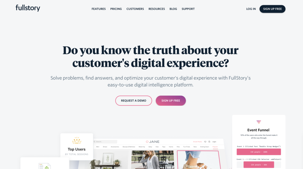
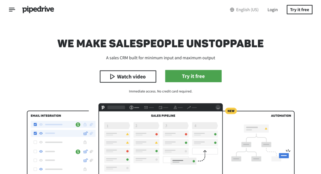
Fullstory uses powerful question that addresses an internal fear of any product owner and provides visitors with an extremely easy solution to get over their fears by trying Fullstory for free.
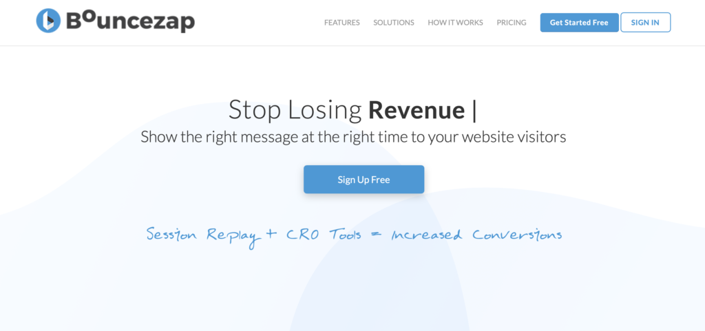
Bouncezap addresses the biggest fears of their target audience in the primary headline on its landing page and offers a solution right below the headline.
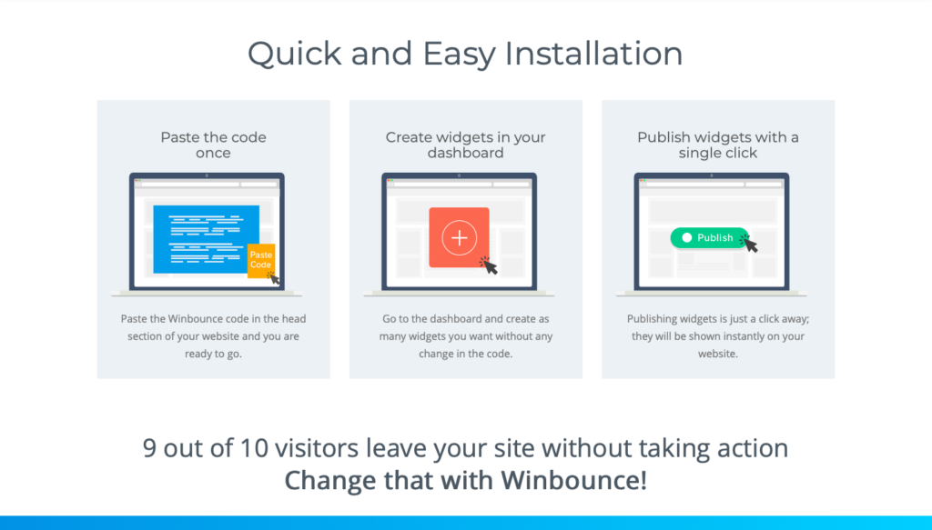
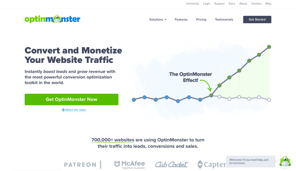
Winbounce addresses their ideal customer’s biggest fear on its landing page (9 out of 10 visitors leave your site without taking action) and presents them with a solution (Change that with Winbounce!)
How to use the technique
- Address fears and uncertainties based on buyer personas. Personalized fears that are relevant to your audience are more likely to boost conversions. Follow steps in our free churn optimization framework to conduct research that will help you understand your audience’s biggest fears.
- Present your software as a solution. Simply igniting fear won’t work. Offer your product as a solution that will reduce their fear and uncertainties.
- Add a clear CTA. Make CTA consistent with fear’s solution. A relevant CTA that shows how easily visitors can get over their fear will have a magical impact on churn rate.
- Offer guarantees. This will address the visitor’s uncertainties about your software’s ability to resolve their fear. For example, offer a risk-free money back guarantee. It will make it easier for your audience to convert.
- Add statistics, numbers, and research to create fear appeal. And immediately after the statistic, pitch your offer as a solution.
- Highlight the benefits of your product. Don’t focus on features as they don’t provide a solution. Stick with the benefits of your software.
- Use relevant words in the headline to trigger fear such as ‘behold’, ‘beware’, ‘unbelievable’, ‘bitter truth’, etc. Power words make your job easier. Use this free guide to learn how to test different power words for conversion optimization.
Mistakes to avoid
- Overdoing it. When you only (or mostly) use fear to generate leads, your audience will get used to it and won’t respond appropriately. Use it occasionally to be effective at it.
- Failing to provide a solution. If you cannot convince visitors that your product provides them with an easy solution to get over their fear, they won’t convert. The idea is to provide a solution to their fear.
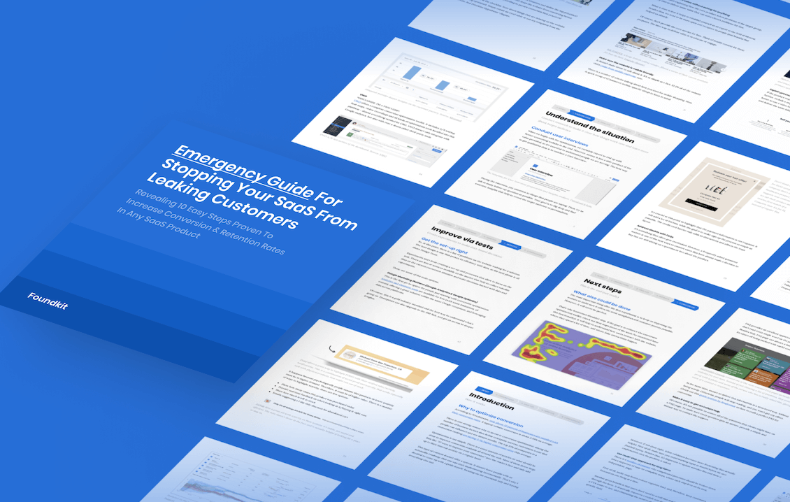
FREE OPTIMIZATION GUIDE
Stop Your SaaS From Leaking Customers With Our Proven Optimization Process
We will reveal an EXACT framework we use to improve conversion & retention rates of our SaaS clients by at least 30%.
DOWNLOAD FREE PDFResearch evidence
Kaylene Williams reviewed the literature on fear appeal theory and concluded that fear motivates people to take action to reduce the fear (or threat arising from the fear). Fear appeal refers to negative results of not using a product and it is effective in developing an individual’s interest. A frightened individual is more likely to take preventive action.
—
Fear motivates people to take action to reduce the fear. Present your product as a solution to the problem causing this fear and you are all set.
Related techniques SEE ALL THE TECHNIQUES >
LOOKING FOR THE WAY TO STOP YOUR SAAS FROM LEAKING MONEY?
Download our FREE guide with the battle-tested process for SaaS conversion & retention optimization
Get a PDF with an exact step-by-step framework we use with our SaaS clients to research why their SaaS is leaking money, define optimization opportunities and run data-driven experiments that bring tangible ROI.